BRANDING & visual identity
The Grove
/ agri-business think tank at the Western Fair District
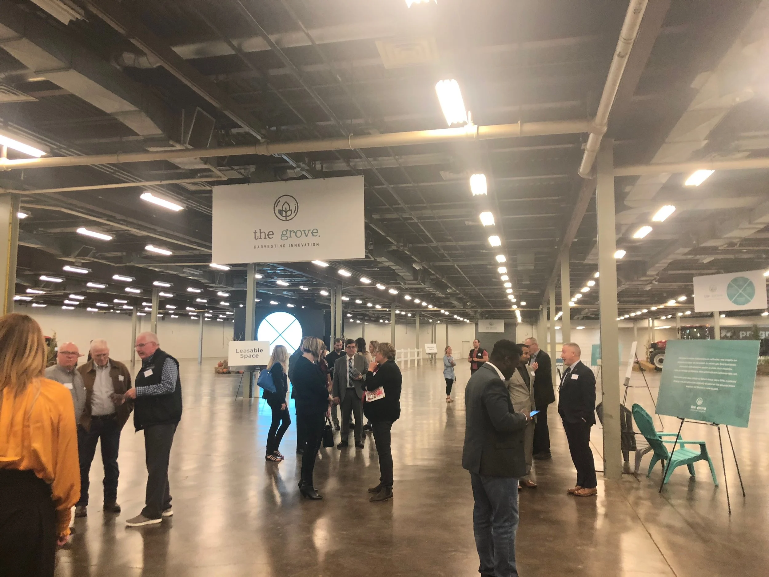
The challenge for this job was to develop a brand for a new agri-business hub created by the Western Fair District in London Ontario. The aim of the venture was to create a community where participants share resources, space, and connections to create the right conditions for innovation, education, and growth.
To attract this community we developed an eye catching brand that embodied the inventive spirit of a start up, the rustic nature of the agri-business sector and the progressive modernism of a space meant for technical innovation.
The logo
The typography in the main text is reminiscent of a typewriter, and highlights the messiness and rounds of ideation that are necessary for true innovation. The bumps and imperfections within the letterforms harken to the feeling of quickly jotted down thoughts during a bolt of inspiration in a brainstorm. In direct contrast to this, the tagline text and icon are both clean, smooth and modern, speaking to professionalism and the technical proficiency of a finished product. The leaf within the icon represents the agricultural sector with the bubble around it acting as the hub itself.
The teal was chosen for the primary colour as a mix between the bright forest green usually seen in environmental and agricultural ventures and the blue tones usually seen in more technological and corporate spaces.
Brand kickoff
Project information
Project done for: The Western Fair District
Year: 2019
Team: adHOME creative
Skills used: logo design / branding / visual identity / typography / layout / editorial design / social media / digital marketing


