BRANDING & visual identity
Wine & Food Show
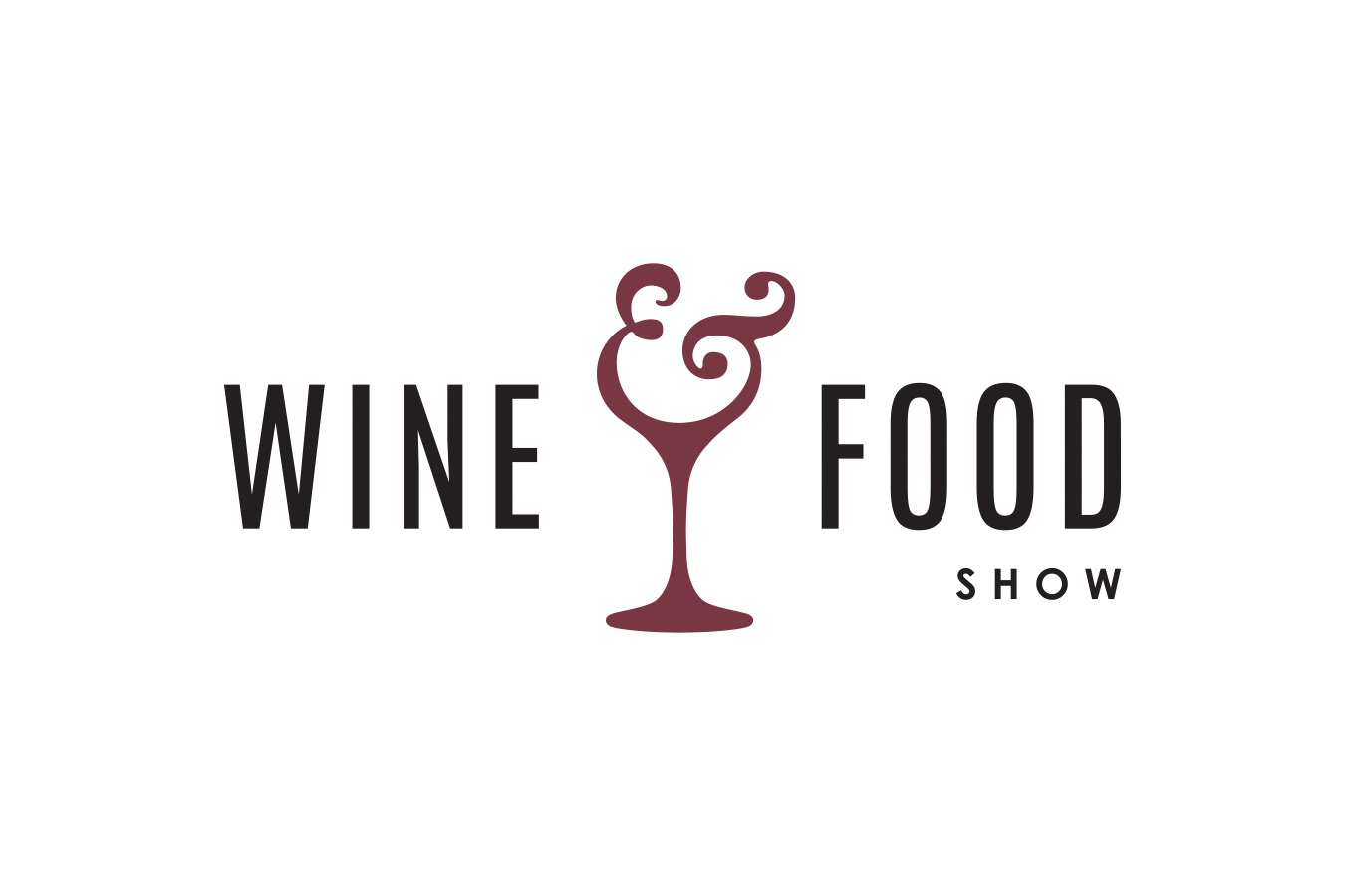
/ Western Fair District event logo
London’s Western Fair District wanted to rebrand one of their more popular yearly events - the Wine and Food show. The two-day event welcomes wineries from across Ontario, as well as a mix of local restaurants to create a unique night out that provides an opportunity to sample some of the region's best food and drink.
They wanted to elevate their brand with a logo that really represented the quality of the offerings of the region. The new brand needed to be elegant, modern and a bit playful, to attract new attendees.
The logo
The typography in this logo takes inspiration from high-end fashion brands and modern gourmet restaurants. It uses simple, bold, sans serif type that features sharp clean edges and a sleek compressed style.
The icon in the logo was created by combining a unique traditional ampersand with a wine glass. The form of the ampersand makes it appear as though the wine is playfully being swirled in the glass, creating and memorable icon that can be used within the logo or pulled out.
EVENT IMAGERY
Project information
Project done for: Western Fair District
Year: 2019
Team: adHOME creative
Skills used: logo design / branding / visual identity / typography / layout


