BRANDING & visual identity / web
WRRC
/ women’s rural resource centre
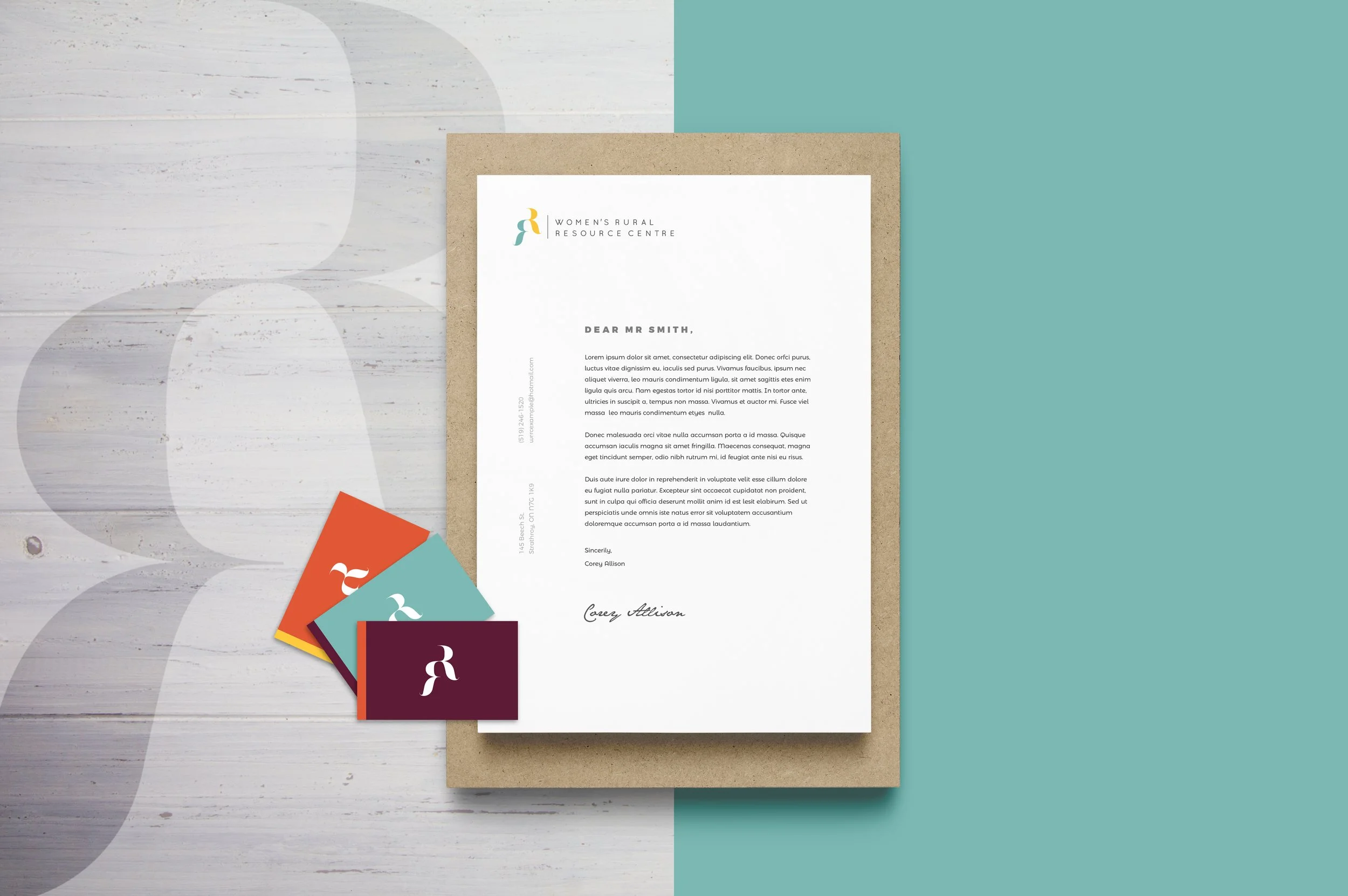
The Women’s Rural Resource Centre, in Strathroy Ontario, decided to rebrand because they felt their old look no longer fit the mission and values of their organization. The aim of this project was to update and modernize WRRC’s image, rebranding them to align with their progressive, feminist ideals while also paying homage to their heritage as a trusted service provider and shelter for women in need.
To achieve this we created a brand as well as a website that is approachable and comforting for potential clients, while also remaining bold and unapologetically feminine.
logo set
The logo
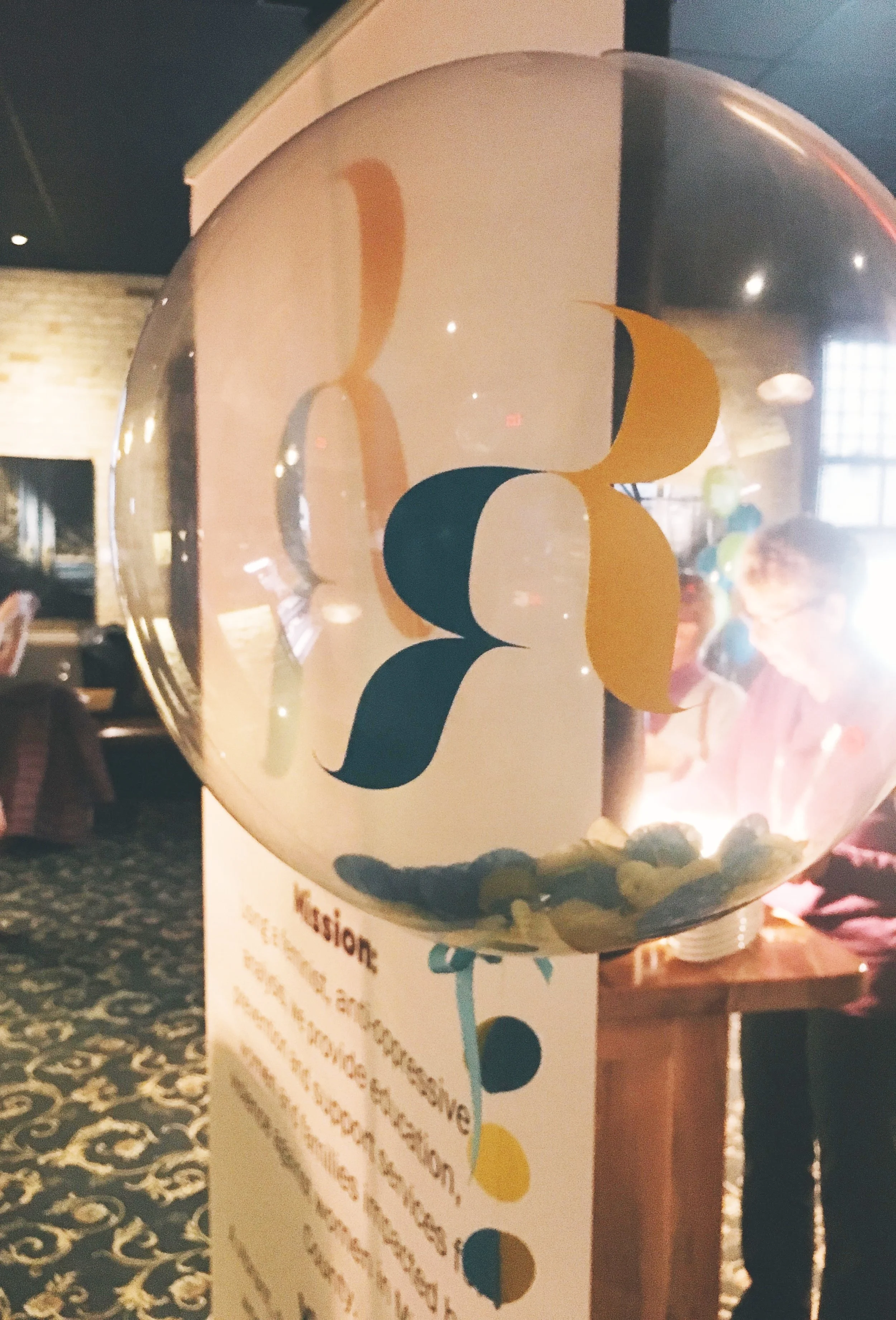
The monogram icon in the logo is comprised of the two middle ‘R’s’ in the acronym WRRC. I wanted one ‘R’ to be facing forward, as if looking to the future and embodying all of the progressive, empowering, feminist ideals the organization strives to convey. The second ‘R’ looks to the past, honouring the work of all the women who came before and the heritage of the shelter and everything it has done for the community. These two R’s blend seamlessly together, not competing, but supporting one another. This is in reference to the goals of the organization, wanting to blend tradition with new modern ideas.
The ‘R’ forms themselves are created from a font that is both traditionally feminine and undeniably bold. It is both refined and strong. This is to resemble the idea of finding power as a woman - that women are inherently strong, without having to loose their femininity or uniqueness to do so.
Branding Manual Excerpt
Brand Launch Event
Project information
Project done for: WRRC
Year: 2018
Team: adHOME creative
Skills used: logo design / branding / visual identity / typography / layout


